






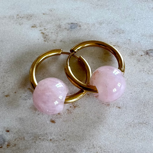


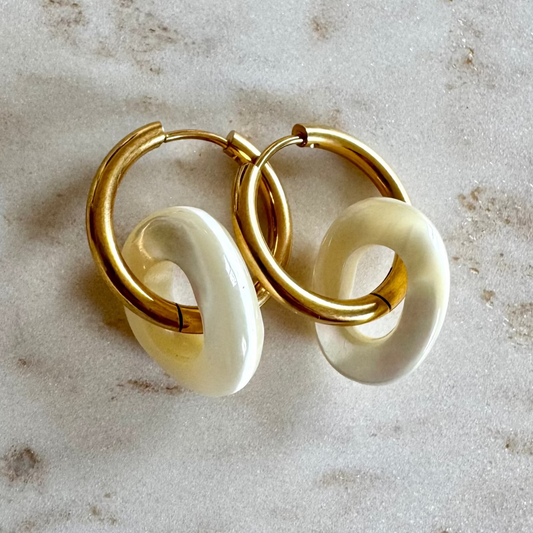
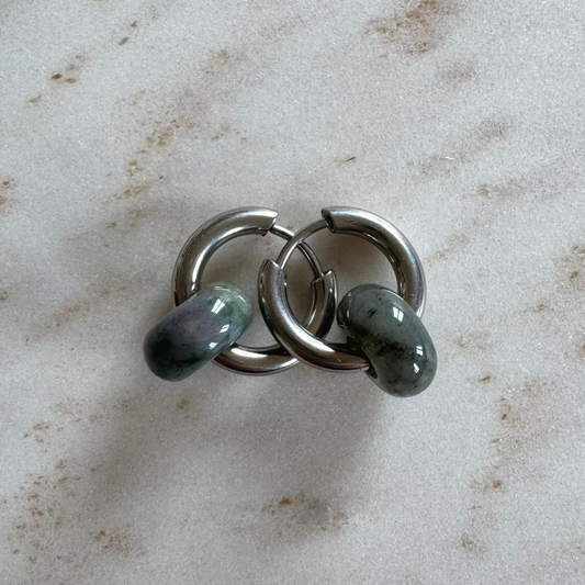


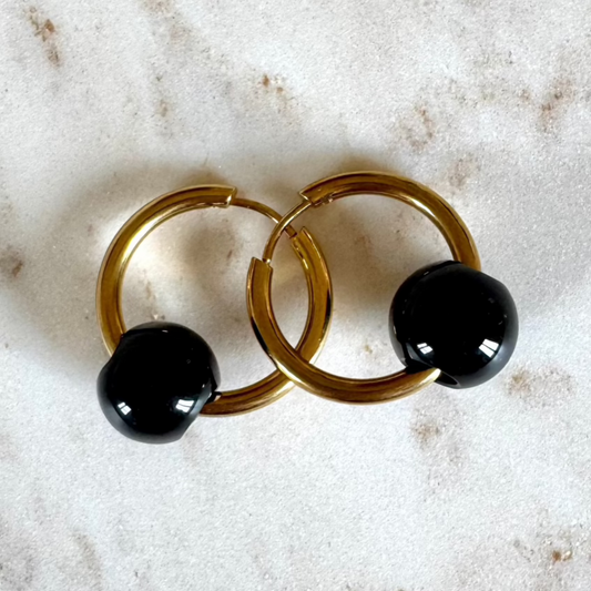


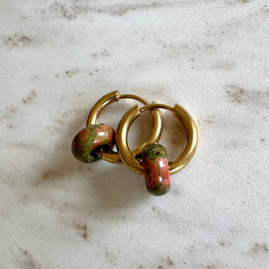




Sometimes you feel it straight away: a room in soft beige calms you, a golden candle lifts your mood, a deep green detail lets you breathe again. That is what colours and their effects are all about: the quiet but powerful language through which colours speak to our mood, our emotions and our rituals. We rarely choose colours at random. Most of the time we intuitively reach for the shade we need right now.
Colours and their effect on energy and mood
Colours are more than decoration. They give rooms direction, rituals depth and our everyday lives a certain frequency. A colour never works in complete isolation. Light, material, season, personal experience and even your current state of mind change how we perceive it.
Still, there are tendencies many people experience in a similar way. Warm colours like red, orange or gold tend to feel energising. Cool shades like blue, grey or silver bring calm and a sense of space. Earthy nuances like brown, sand or olive feel balancing and down to earth. Living consciously with colour doesn't just make your surroundings more beautiful, it makes them clearer.
In everyday spiritual life in particular, this can be very powerful. When you set an intention, the right colour supports the feeling behind it. It doesn't replace your inner work, but it strengthens it. A colour can be an anchor: quiet, present and felt every day.
What does each colour stand for?
White: clarity, cleansing, new beginnings
White feels open. It creates space, brings order to your thoughts and adds an almost silent kind of light to everyday life. In rituals, white often stands for cleansing, protection and new chapters. That is why this colour is especially fitting for moments when you want to let go or realign.
At the same time, too much white can feel cool or distant. If a room seems too sterile, natural materials, warm candlelight or soft cream and sand tones help to balance it out.
Pink: self-love, gentleness, opening the heart
Pink carries a soft energy. It brings to mind care, compassion and emotional self-care. Especially in phases when you want to be kinder to yourself, pink can be a strong companion. Not loud, but nurturing.
The shade matters. Powdery pink usually feels soothing and feminine, bold pink more daring and lively. Both have their place. It depends on whether you need comfort or want to combine heart energy with self-confidence.
Red: strength, grounding, passion
Red is a colour with presence. It stands for vitality, courage, sensuality and life energy. When you feel drained, unclear or too much in your head, red can help you reconnect with your senses.
But red isn't always the right choice. In stressful phases or in rooms that are meant to be restful, too intense a red can add to a sense of restlessness. Small accents are often enough: a red detail on your altar, a stone, a cloth or a candle for a targeted boost of energy.
Orange: joy, creativity, movement
Orange carries warmth and lightness. This colour can help when you feel stuck, overthink or are looking for new momentum. It suits creative processes, morning rituals or moments when you want to reconnect with the joy of life.
Orange is often underrated because it can quickly feel very loud. In muted, terracotta-like nuances it becomes softer and more grown-up. Then it brings warmth without dominating the room.
Yellow and gold: self-confidence, abundance, light
Yellow is the colour of inner light. It is often associated with optimism, clarity and mental alertness. Gold expands this energy with dignity, worth and abundance. In manifestation rituals or around themes like visibility and personal power, both shades are especially popular.
Here too, the undertone makes the difference. A very glaring yellow can feel unsettling, while a warm honey yellow or matt gold feels uplifting and elegant. If you want to bring more radiance into your home without creating restlessness, warm gold nuances are often just right.
Green: growth, balance, heart chakra
For many, green is the colour of renewal. It brings to mind nature, growth and inner balance. Especially when your everyday life involves a lot of screens, speed and stimulation, green feels like a gentle energetic counterbalance.
In a spiritual context, green is often associated with the heart space: with trust, compassion and emotional growth. Sage, eucalyptus, olive or moss green usually feel grounded. A bright spring green feels fresher and more energising. Both directions work, just for different needs.
Blue: calm, intuition, depth
Blue often slows your inner pace almost automatically. It creates a sense of space, clarity and an almost meditative calm. That is why it fits beautifully into quiet retreats, evening rituals or moments when you want to listen more closely to your inner voice.
Dark blue can feel very protective and deep, light blue more airy and cleansing. If blue is used too coolly, though, some people miss warmth. Contrasts with wood, candlelight or soft textures help here.
Violet: spirituality, transformation, reflection
Violet carries something mysterious. It is often associated with intuition, spiritual opening and processes of change. This colour is especially fitting when you meditate, lay out cards, journal or explore deeper questions.
Too much violet can make you feel a little detached, though. If you already feel rather ungrounded, it is better to combine it with beige, brown or green. That way the energy stays open without drifting off.
Brown, beige and natural tones: security, grounding, trust
Natural tones are often underrated because they are quieter than bold colours. That is exactly where their strength lies. They calm, support and create a feeling of home. If you quickly feel overstimulated or need more stability, these tones are often the best foundation.
They also combine beautifully with almost any other colour. That creates balance: a calm base plus a conscious accent colour for your current intention.
Using colours and their effects mindfully at home
It doesn't have to be a complete redesign. Often a small detail is enough to change the atmosphere of a room. A candle, a cushion, a cloth, a crystal or a ritual object in the right colour can do more than a big makeover without a clear intention.
In the bedroom, soft, calming colours usually work better than very stimulating ones. For a meditation spot, shades that offer both space and security are a good fit: cream, sage, rosé or deep blue, for example. In your workspace, a touch of yellow, gold or orange can help you feel focused and motivated, as long as the base stays calm.
It is important not to choose by trend alone. Ask yourself instead: how do I want to feel here? Supported, clear, soft, awake, brave? Once you have answered that question, the right colour often finds you on its own.
Colours in rituals and intentions
Colours are especially powerful when they are connected to a clear intention. A white candle for cleansing, a pink one for self-love, a green one for growth or a golden one for abundance: these associations aren't a rigid rule, but they give your ritual a tangible form.
The lovely thing is that you don't need a complicated practice. Even one mindful moment with a colour can make a difference. You light a candle, hold a stone in the matching shade, wear jewellery in a particular colour or place a card on your bedside table that reflects your current energy.
If you like, you can work with affirmations as well. With pink, for example: I meet myself with love. With green: I allow myself to grow. With gold: I am open to abundance. This is how colour, feeling and language come together in a ritual that doesn't have to be perfect to be real.
Why colours don't feel the same for everyone
As helpful as general colour meanings are, they don't replace your own perception. Perhaps blue brings you calm while it creates distance for someone else. Perhaps you feel free in white while for another person it means emptiness. Both are valid.
Colours carry collective symbolism, but personal history too. That is why intuition isn't a nice extra here, but central. If a colour calls to you even though it supposedly doesn't match your theme, it is worth listening. Often your system already knows what feels right.
The amount makes a difference too. A single red accent can be invigorating, a whole room in bold red can quickly be too much. A little violet can inspire, too much can overwhelm. Choosing consciously doesn't mean using as much as possible, but dosing with care.
Colours as a daily reminder of your direction
Perhaps this is the most beautiful effect of colour: it brings you back to yourself. Not dramatically, but in everyday life. A warm shade on your altar. A soft pink in your morning routine. An earthy green that helps you land again in the middle of chaos. That is where colour becomes more than aesthetics.
At LETGOFLOW, we see this connection between beauty, energy and ritual as something very real. The things around you don't just have to look beautiful. They can remind you, hold you and lift you up.
When you choose colours consciously, you don't just shape rooms or looks. You shape how you feel in them. And sometimes a new chapter doesn't begin with a big step, but with exactly the shade that finally brings you back into harmony.